Why Blood Test Results Belong on a Body Map
Patients understand an organ lighting up faster than a table of 60 numbers.

Priti Rohatgi
Product & Delivery
Reports are written for labs, not people
A full-body panel can return dozens of values. Most patients scan for bold text and miss the trend that matters.
Organise by organ
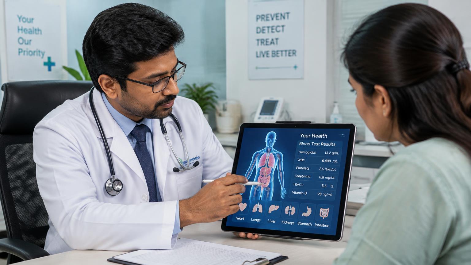
A body map places each marker where it belongs: TSH on the thyroid, ALT and AST on the liver, creatinine on the kidneys, lipids near the heart. Tapping an organ shows its values, ranges and status.
Three states, not sixty decisions
Each marker is shown as in range, borderline or out of range. Areas that need attention pulse, so the consultation starts where it should.
Linked to the follow-up
The same screen shows the prescription sent to the pharmacy, the payment and the next follow-up date, so the report becomes a plan.
Topics & keywords
- health dashboard
- blood test report visualisation
- patient portal
- HyperCare
Key Takeaways
- Group markers by organ.
- Show status, not just numbers.
- Connect the report to prescription and follow-up.
Frequently asked
Are the dashboard values on your site real patient data?
No. The HyperCare dashboard on our site uses clearly labelled sample data.